(Description)
Location: Nagpur, India
Industry: FinTech | Small Business Tools
Scope: Logo Design | Brand Identity | Visual Language
Project Overview
We partnered with Simple, the billing and invoicing solution developed by Tacktile Systems Private Limited, to design a logo and visual identity that reflects the product’s commitment to making invoicing easy, intuitive, and professional for small businesses. Simple helps users create professional invoices, track payments, handle receipts, and manage core billing operations- all from a streamlined, user-friendly interface.
Our goal was to conceptualise a logo that visually communicates clarity, reliability, and simplicity- core pillars of the brand- while resonating with entrepreneurs, freelancers, and small business owners in India and beyond.
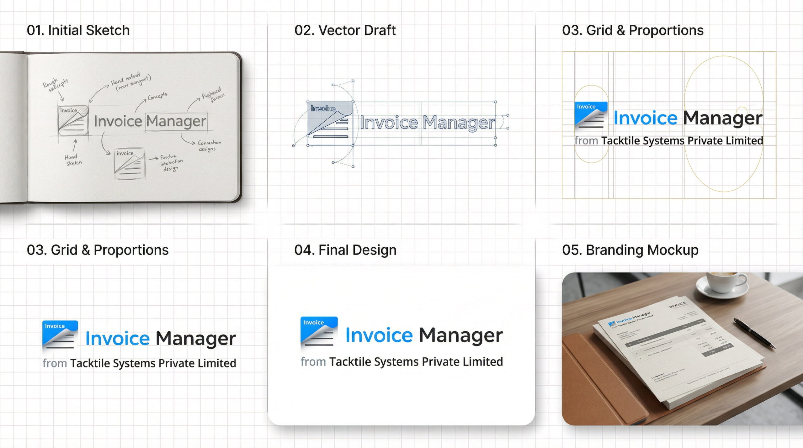
Our logo design process included:
The final logo now serves as the core visual anchor for Simple- a brand built on making business invoicing effortless. The identity enhances recognisability on stores, screens, and marketing channels while reinforcing the product’s promise of simplicity and professionalism. By aligning visual design with product values, the brand now presents a cohesive, memorable identity that supports user adoption and trust in competitive small-business software markets.